Most of the boxes are unpacked and most of the furniture is in place, but until we get things hung up, it just doesn't feel like home.
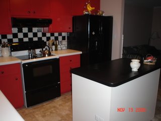
The pictures from our kitchen make over are here. I hope you like what you see. It really was a make over!
 The before pictures are first. Notice the black and white theme going on here! The floor might be cool, if it wasn't also in the den!
 Please excuse all the trash. Notice the cabinets, black and white. Also, the backsplash, black and white tile!
 This picture shows the extreme of the black and white fan to match the theme. You can also see the walls are white and the trim is black. You can't see the door that leads to the bonus room, but it is also black.
 Ahh, much better. The island was moved back in because it does look pretty good with the backsplash. The chili pepper red cabinets do make the kitchen look some what like a diner.
You can't really see the floor, but it is a khaki vinyl. It makes the den look much better.(pictures of the before and after den are on the way). Justin put up a cool silver light to replace the fan. He is becoming quite the handyman around here!
I hope you enjoyed our make over. Let me know what you think. It is okay if you don't like it. It is a little drastic, but what do you do with a small budget and a black and white tile backsplash? Any other suggestions? More make over pictures of the den and bonus room are on the way!
2 comments:
First thought when I saw the first pictures was that there should be a disco ball hanging from the ceiling instead of a fan! LOL! But that was a great idea painting the cabnets red. It looks really good...I have a friend who has a red, black, and white kitchen...she would love this! :)Can't wait to see pics of the rest of the house!
I was also thinking that your kitchen reminds me of Southern Living. They have some really beautiful things that would go great in your kitchen....some roosters and other things with that color scheme.
(I always look through their stuff and then go to Garden Ridge and buy similar items for way cheaper) But you can find some really cute ideas...wire baskets and stuff...just a thought!
Post a Comment